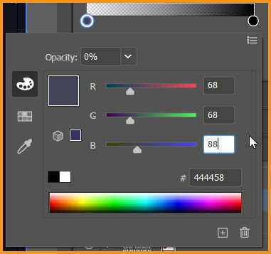
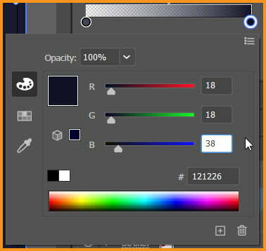
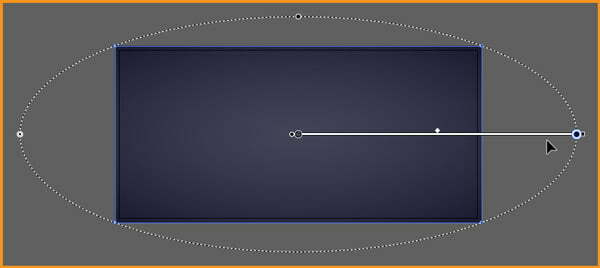
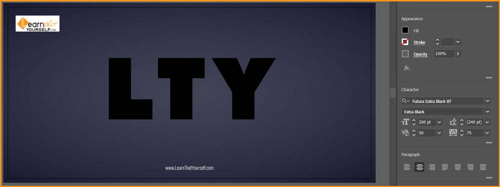
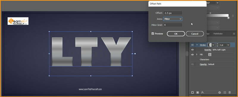
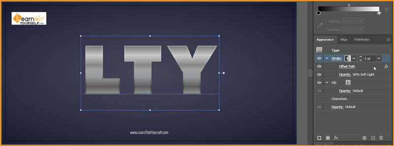
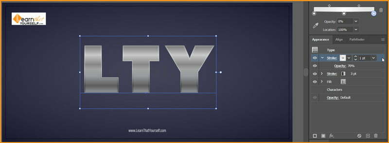
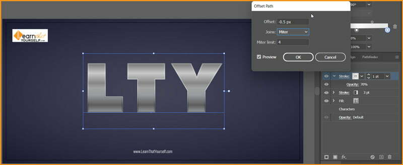
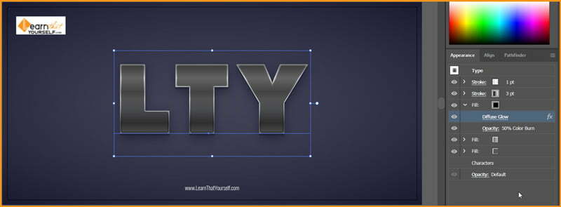
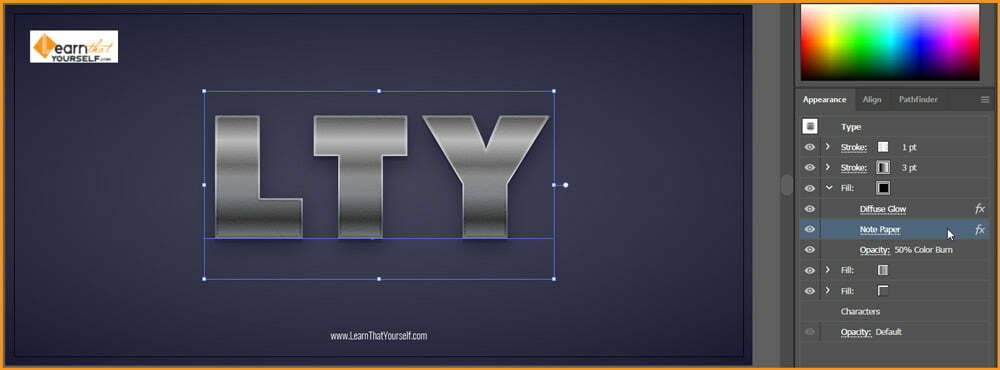
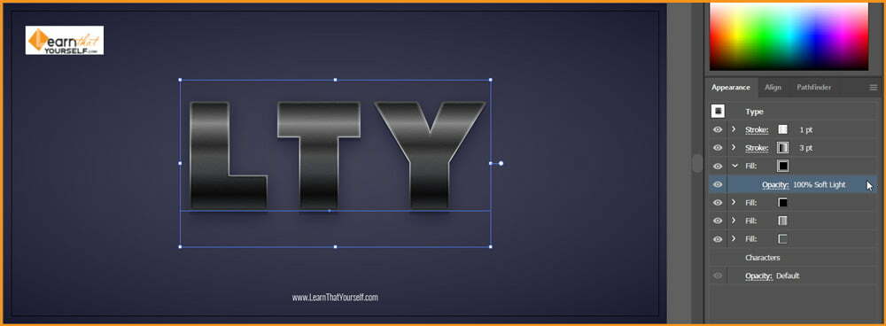
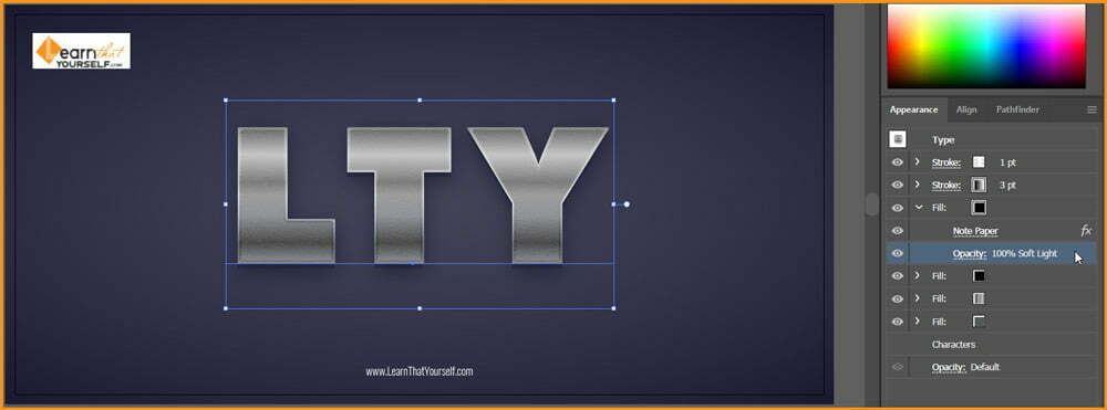
In this blog, we will be learning about, “How to create Dual light effect in photoshop“. It could also be termed as dynamic lighting or dual lighting. I am Lalit M S Adhikari and we are at LTY. Let’s get started.
Procrastination: The Nemesis of Success
Author Steven Pressfield very precisely explained about procrastination it in his book The War of Art. In which he said that “it is the thing that keeps you from doing your work”.
My name is Lalit Adhikari and we are at LTY. Let’s begin!
The Ultimate Guide for Leadership
This Ultimate guide for Leadership, we discuss definition, different types, essential qualities of leadership and much more.
My name is Lalit Adhikari and we are at LTY. Let’s begin!
Creativity is a Journey not Destination
Sometimes, ‘easy’ can be ‘difficult’. Have you ever been assigned any task which is actually difficult to perform but not for everyone? And that is when you experience frustration. It is similar when a boss comes to a meeting and tells you to think ‘outside the box’.
How to Recolor Artwork in illustrator
In this Illustrator Tutorial, we will learn, ‘How to Recolor Artwork in illustrator’.
My name is Lalit Adhikari and we are at LTY. Let’s begin!
Introduction
Recolor Artwork can be used to recolor our artwork with predefined colors using color library, create our own color palette using color wheel or pick a color palette from artwork or images using Color Theme Picker.
We can even create unlimited color variations instantly. All we need to do is play with colors and pick the one that works the best and recolor our artwork at the click of a button.
Related Topics:
How to find Recolor Artwork
Recolor Artwork option can be opened by either of the following two ways:
- Select the Artwork, Go to Properties Panel and Click on the Recolor button.
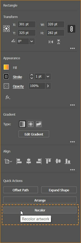
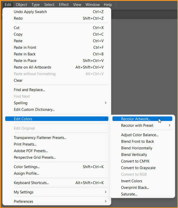
Or Select the Artwork and Go to Edit > Edit Colors > Recolor Artwork…
Related Topics:
- How to Create Silver Metallic Effect in illustrator
- How to Create Flower using Gradient Mesh in illustrator
- How to Create Pressuer Sensitive Brush in illustrator
Recolor Artwork
A dialog box with the following Recolor Artwork options is displayed:
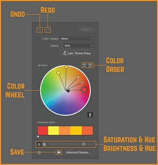
- Undo: Cancel the latest change made to the artwork color.
- Redo: Restore the latest change that was reverted using Undo.
- Reset: Clear all color adjustments and revert to default dialog settings.
- Color Library: Choose a color from the predefined color library.
- Colors: Choose the number of colors you want to show in your artwork.
- Color Theme Picker: Pick color palettes from one or more images, artwork or their select areas and use them in your artwork.
- Color wheel: Display and adjust colors, their order, brightness, saturation and hue.
- Color order: Click to randomly change the order of colors.
- Prominent Colors: Shows all colors that are prominent in your artwork based on their hue and other properties.
- Saturation and Hue and Brightness and Hue: Adjust their value on the slider or randomly change their values using the button next to the color wheel.
- Save: Click this button to save your color palette.
- Advanced Options: Click this button to view the advanced recoloring options.
Related Topics:
- How to Create Metallic Effect in illustrator
- How to set Brush Pressure in illustrator
- How to Design a Retro Flower Pattern
Color Library
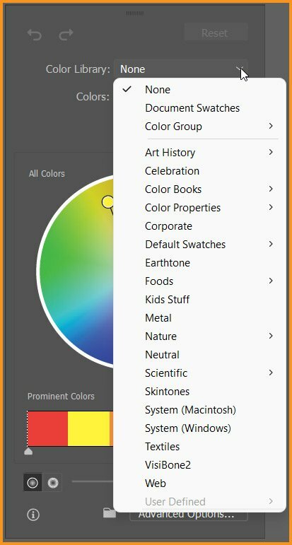
We can use predefined colors available under the Color Library in Recolor Artwork dialog box. We can choose from different color groups, document swatches or preset color themes.
All colors and themes that we’ve defined are added to our Swatches panel as color group and will be available for recoloring.

Related Topics:
- How to create a Semi circle in illustrator
- How to use Mesh Tool in illustrator
- How to use Gradient Tool in illustrator
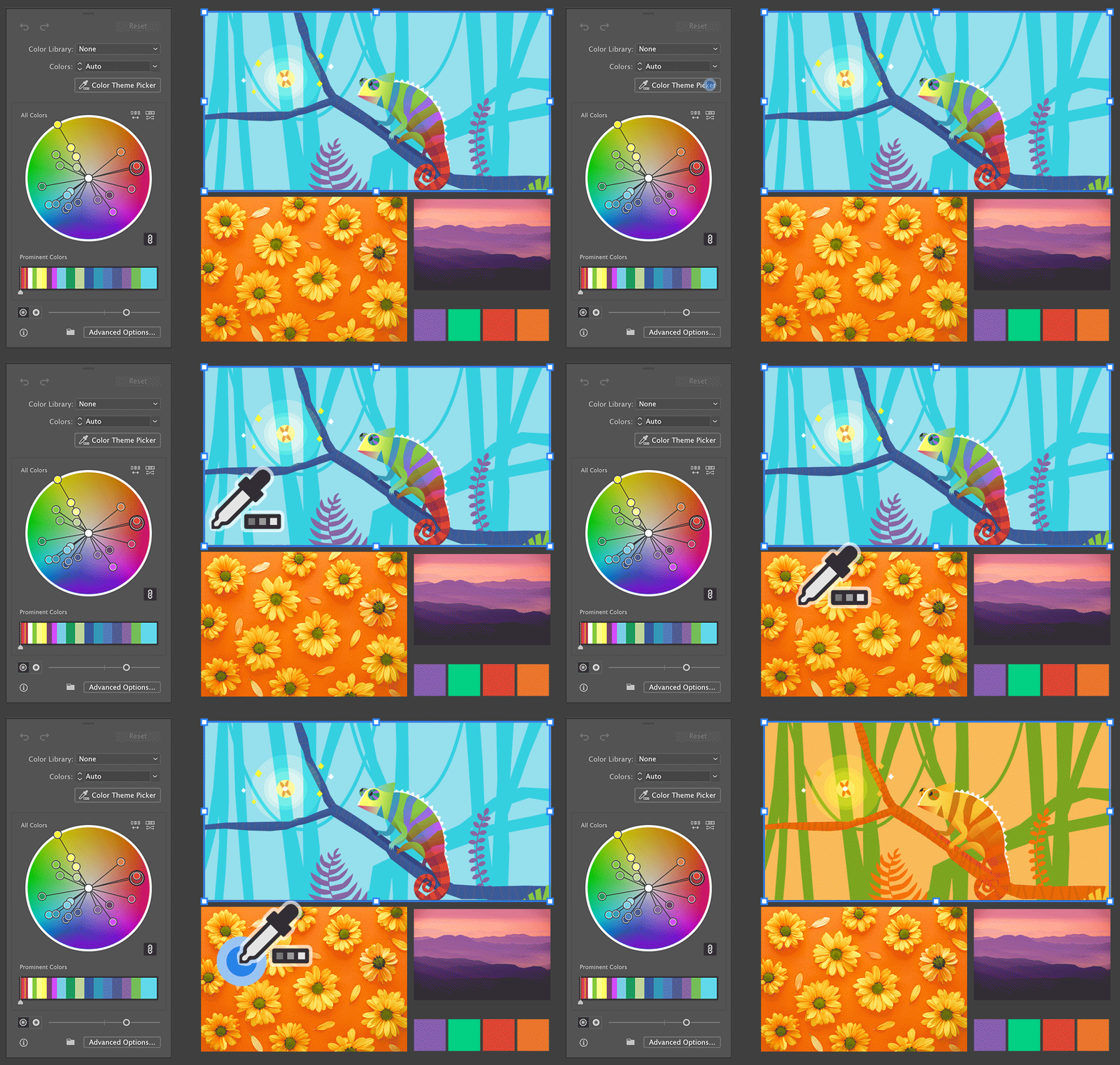
Color Theme Picker
Using Color Theme Picker, we can pick and extract color palettes from one or more artwork or images present on the canvas or form their select portions and recolor our current artwork with them.
Ensure the artwork or images from which we want to pick color inspiration are placed on our canvas. We can extract colors from both vector and raster objects on the canvas.
Do the following steps:
- In the Recolor Artwork dialog box, click Color Theme Picker to activate the color picker.
- Click the object on the canvas from which we want to pick the color palette.
- To pick colors from more than one object, hold Shift and click on the objects.
- Drag to marquee-select specific sections of an artwork to pick colors.
Related Topics:
- How to use Shape Builder Tool, Live Paint Bucket Tool and Live Paint Selection Tool in illustrator
- How to use Width Tool, Warp Tool, Twirl Tool, Pucker Tool, Bloat Tool, Scallop Tool, Crystallize Tool and Wrinkle Tool in illustrator
- All Selection Tools in illustrator
Color Wheel
Color wheel in Recolor Artwork dialog box displays the color stops for all the colors contained in our artwork.
Steps to recolor our artwork using the color wheel:
- Move the color handle shown at the center of the wheel.
- To choose a color from the Color Picker dialog, double-click anywhere on the wheel or right-click the color handle and choose Color Picker.
- To select a shade, right-click the color handle and choose Select Shade.

Add or Move multiple color stops:
- To add a new color stop, right-click anywhere on the color wheel and choose Create New. Now, move this new color stop to pick a color of your choice.
- By default, all the color stops move together. To unlink the color harmony and move color stops individually, click the link icon. Click again to relink the color harmony.
Related Topics:
- How to use Perspective Grid Tool and Perspective Selection Tool in illustrator
- How to use Pen tool in illustrator
- How to use Eraser Tool, Scissors Tool and Knife Tool in illustrator
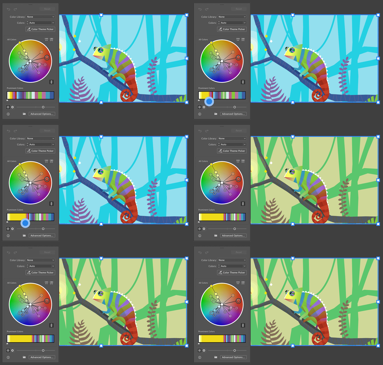
Prominent Colors
We can change the color weight and other properties in the artwork in the Prominent Colors section at the bottom of the Recolor dialog box.
Prominent colors are categorized based on the hue and shade of the color. To adjust the weight of a color in your artwork, hold and drag the edge of the color patch.
Related Topics:
- How to use Paintbrush Tool and Blob Brush Tool in illustrator
- How to use Type tool in illustrator
- How to use Rectangle Tool, Rounded Rectangle Tool, Ellipse Tool, Polygon Tool, Star Tool and Flare Tool in illustrator
Creating different Color versions of Flower
Now, I will take the Flower created in one of our previous Illustrator Tutorial and change it’s colors using Recolor Artwork.
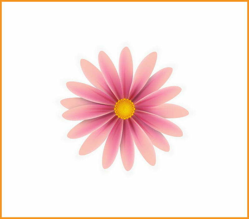
We can easily create other color versions of the same flower using Recolor Artwork in illustrator.
Step:
First, make a copy of the original flower and then go to the Layers panel and select only the group of petals without the mask.
Now, go to Edit > Edit Colors > Recolor Artwork
Type in the shade of purple indicated and hit OK. As a result, your pink petals will turn into purple petals.
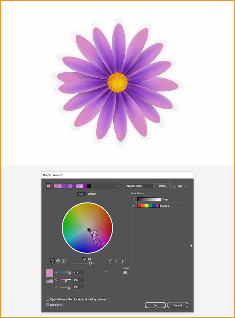
Using this simple step, we can create multiple colored copies of the flower.
If you are following our Free Illustrator Lessons and Tutorial Guide, then next you should read about, “How to Create Silver Metallic Effect in illustrator“.
Related Topics:
- How to use Line Segment Tool, Arc Tool, Spiral Tool, Rectangular Grid Tool and Polar Grid Tool in illustrator
- Principles of Design
- Elements of Design
- Basics of Design
- What is Digital Painting
How to Create Flower using Gradient Mesh in Illustrator
In this Illustrator Tutorial, I will show, ‘How to Create Flower using Gradient Mesh in Illustrator’.
Introduction
I’ll start with the shape of the petals and then using the Gradient Mesh, I’ll add the mesh points and color it. Then I’ll compose the flower with the stamens in the center.
For stamens, I’ll use a custom Scatter Brush, along with the Transform effect and the Gradient Mesh of course.
After that I’ll continue to add details on the petals with the help of the Blend Tool, Pucker & Bloat and Transform effects.
Related Topics:
- How to use Mesh Tool in illustrator
- How to Create a Retro Flower Pattern in illustrator
- How to Create Metallic Effect in illustrator
Minor Changes in Preferences
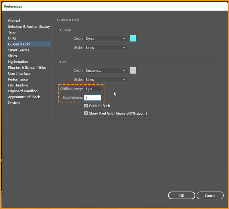
To create the flowers, I’ll need a grid every 1 px, so go to Edit > Preferences > Guides & Grid and enter 1 in the Gridline every box and 1 in the Subdivisions box.
I know Grids seem complex but try not to get discouraged by all that grid—it will make your work easier and keep in mind that you can easily enable or disable it using the keyboard shortcut CTRL + "
Create New Document
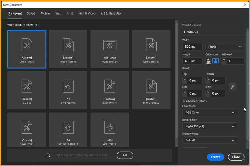
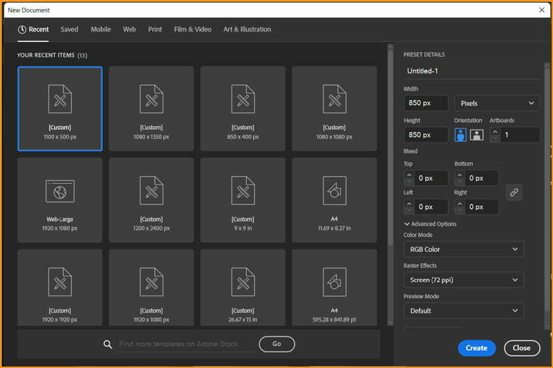
Create a New Document with Width and Height of 850 px, Color Mode set as RGB and Raster Effects as Screen (72 ppi).
Creating Flower Petal
Step 1
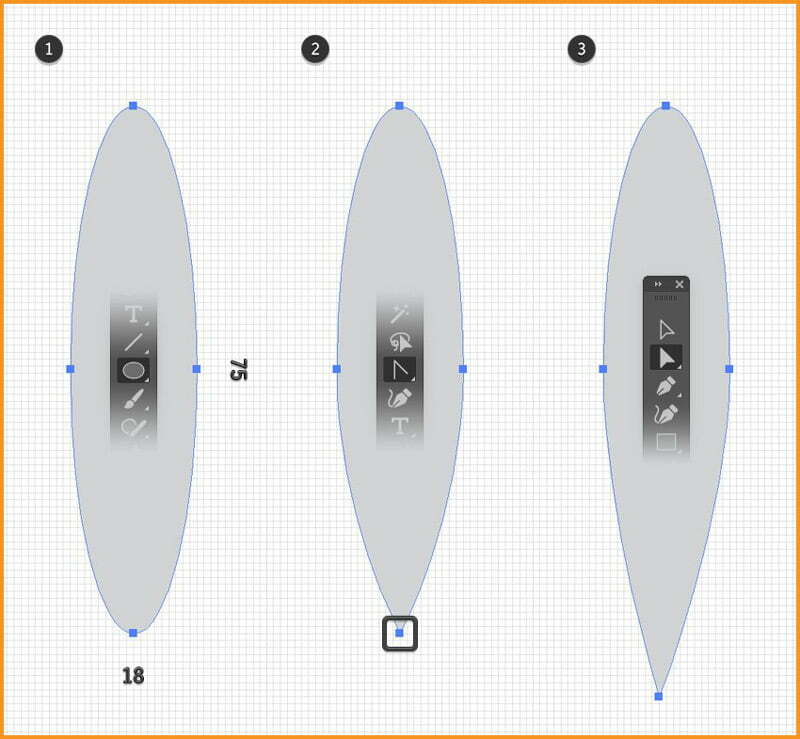
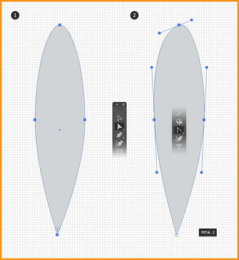
A Flower design starts with a petal. Chose the Ellipse Tool and draw an 18 x 75 px ellipse. Pick Anchor Point Tool inside Pen tool and click the bottom anchor point to turn it into a sharp point.
Now, with the help of Direct Selection Tool, select only the anchor point at the bottom and move it about 9 px down and 1 px to the left.
Step 2
I’ll start with the shape obtained in the previous step to create different petals. So, before I continue, I’ll make a copy CTRL + C and then CTRL + V and keep it for the second petal.
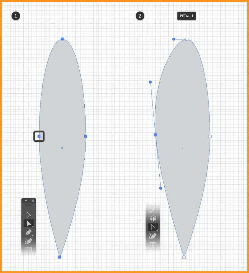
Now, select Direct Selection Tool to select only the anchor point on the left and move it a little to the left.
Also move the handles as shown in image below. I can make extra adjustments if I want but the petal is pretty much ready. I will name this shape “petal 1”.
Step 3
Now I will select the copy that I created earlier and modify it to create the second petal. Select the Anchor Point Tool, click the left and right points and then drag the handles as shown in the following image.
Move the handles of the top point as shown below and use the Direct Selection Tool to adjust just the left handle as shown. I will name the shape “petal 2”.
You can create only one petal but for variety I decided to go with two.
Step 4
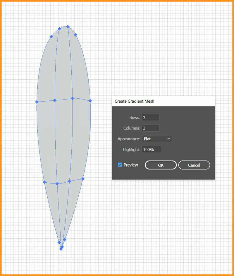
Now I’ve the two flower petals. I’ll select “petal 2” and then go to Object > Create Gradient Mesh with 3 Rows and 3 Columns and click OK. The petal looks like the one below at this point.
Step 5
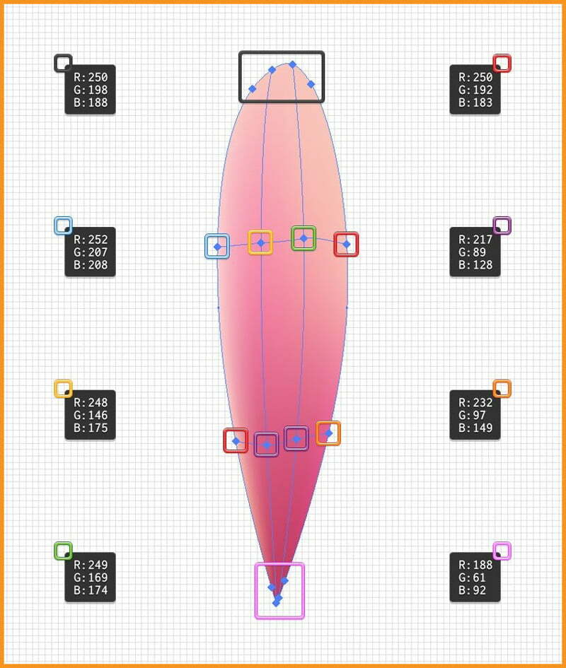
By using the Direct Selection Tool, I can select each mesh point and color it. In this case, I’m using shades of pink.
Follow the color codes shown in image belwo to replace the gray fill of each point with the colors indicated and we can hold down the SHIFT key to easily select multiple points.
The petal should look like as shown in the next image.
Step 6
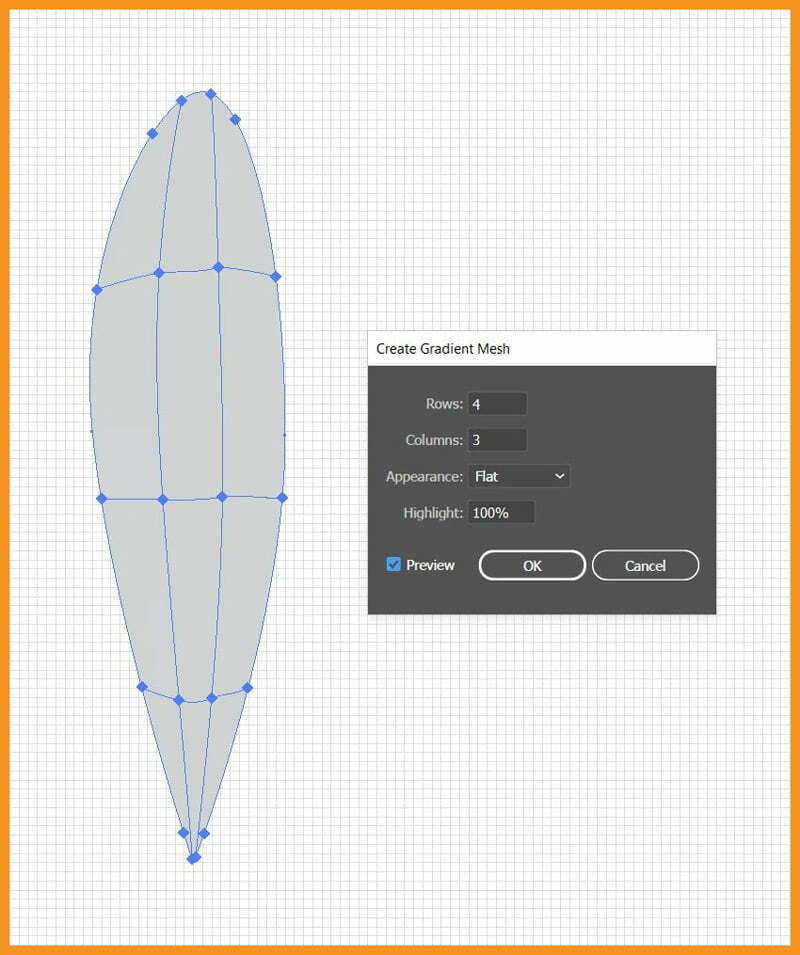
I will turn back to “petal 1” and go to Object > Create Gradient Mesh with 4 Rows and 3 Columns and click OK
Step 7
As I had already shown above, I will color the petal using shades of pink again.
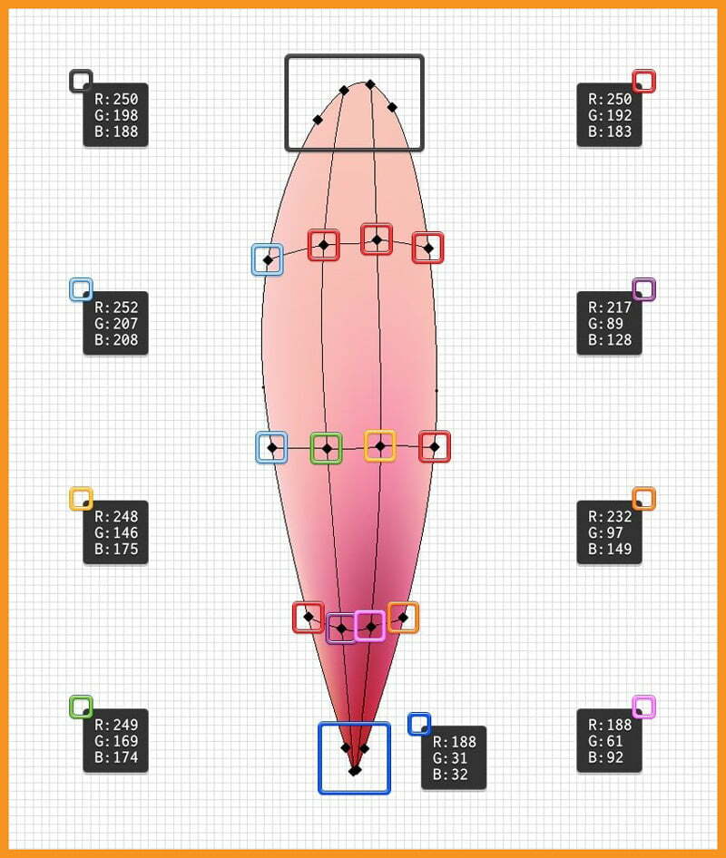
Step 8
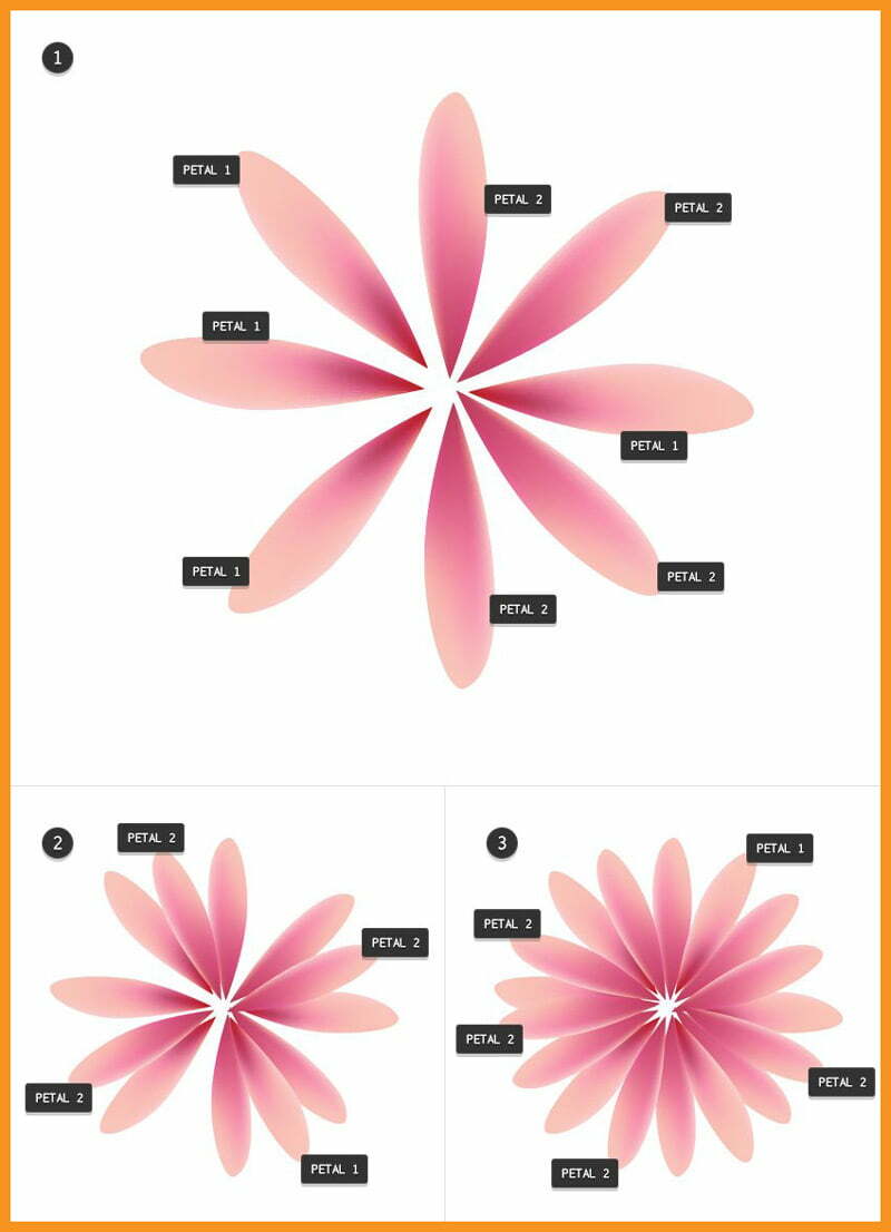
Now as I’ve created Flower Petals, I can disable the Grid using shortcut CTRL + " and also disable the Snap to Grid using shortcut SHIFT + CTRL + "
Now I’ll duplicate both “petal 1” and “petal 2” and then rotate and arrange them as shown below to create the flower.
Creating Center of Flower
Step 1
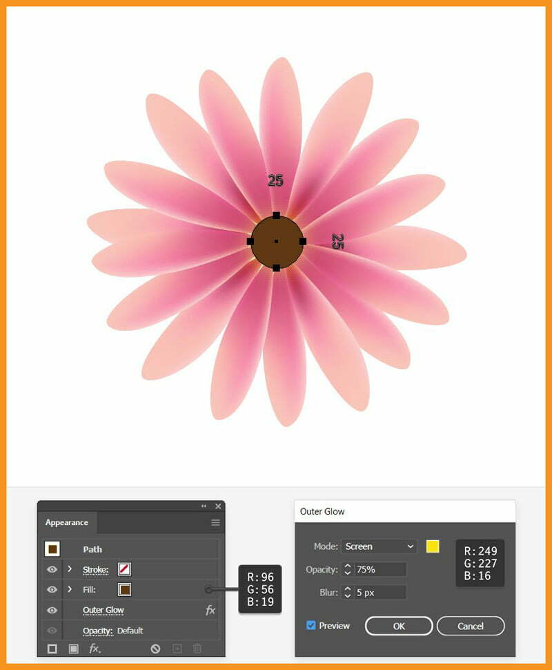
Select the Ellipse Tool, draw a (25 x 25) px circle and select R=96, G=56 and B=19 as the fill color.
With the circle still selected, go to Effect > Stylize > Outer Glow effect using settings shown below.
Step 2
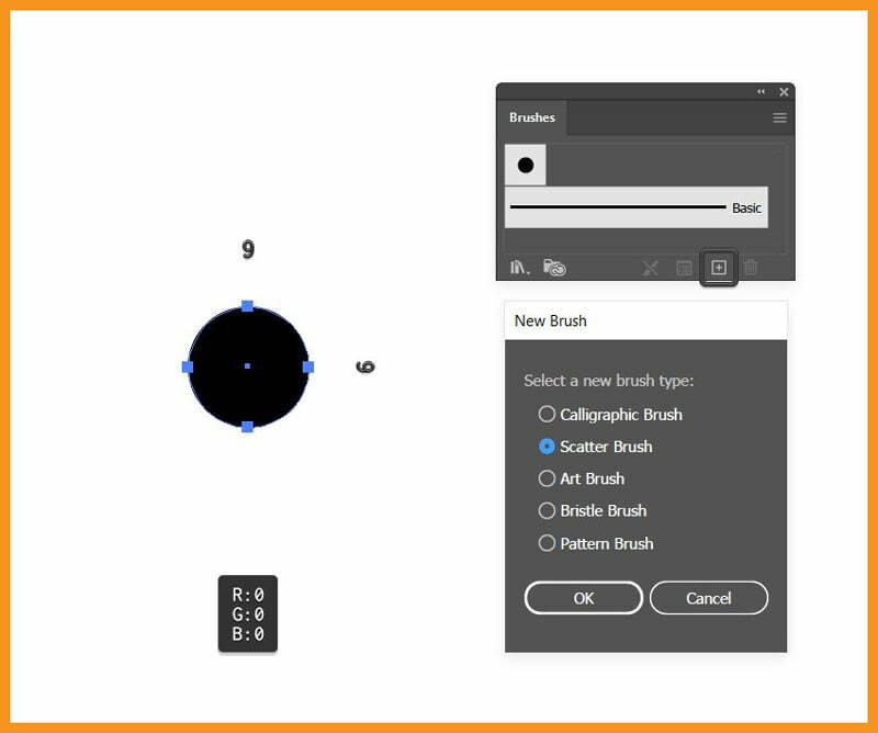
Select Ellipse Tool, draw a small circle and with a black fill. Drag this circle to the Brushes panel and choose Scatter Brush. Leave the settings as it is and click OK
Step 3
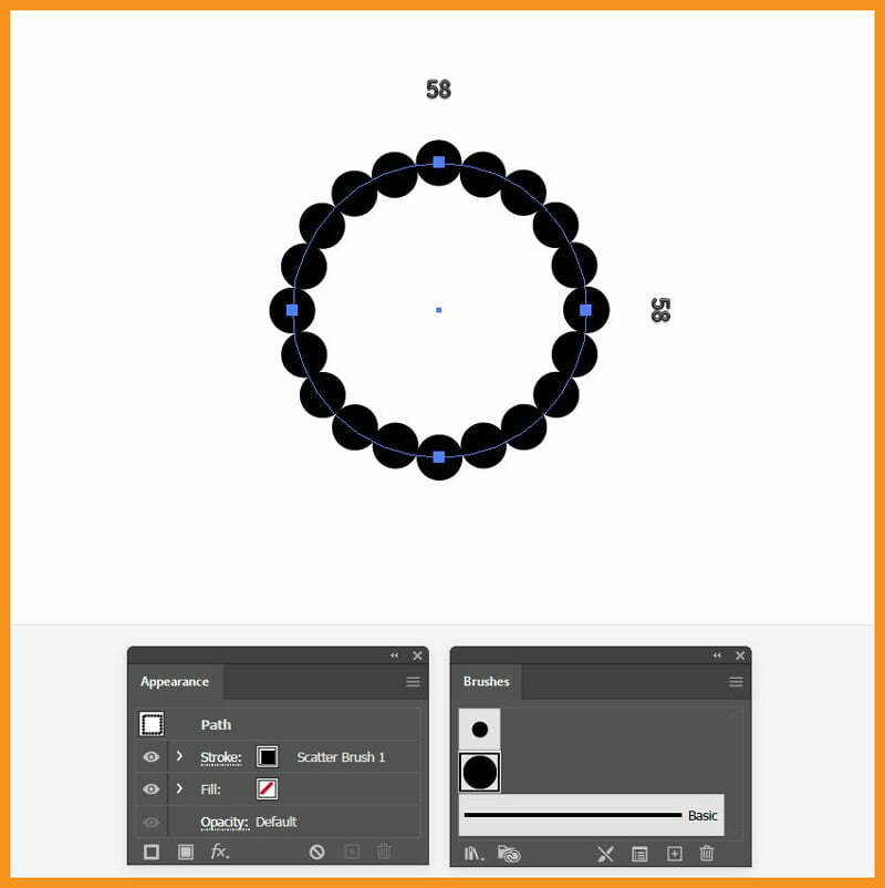
Create a new circle with values shown below and give it a 1 pt black Stroke Weight. Also Stroke the circle with the Scatter Brush saved in the previous step.
Step 4
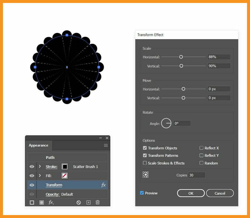
Select circle, go to Effect > Distort & Transform > Transform and apply the settings shown below.
Step 5
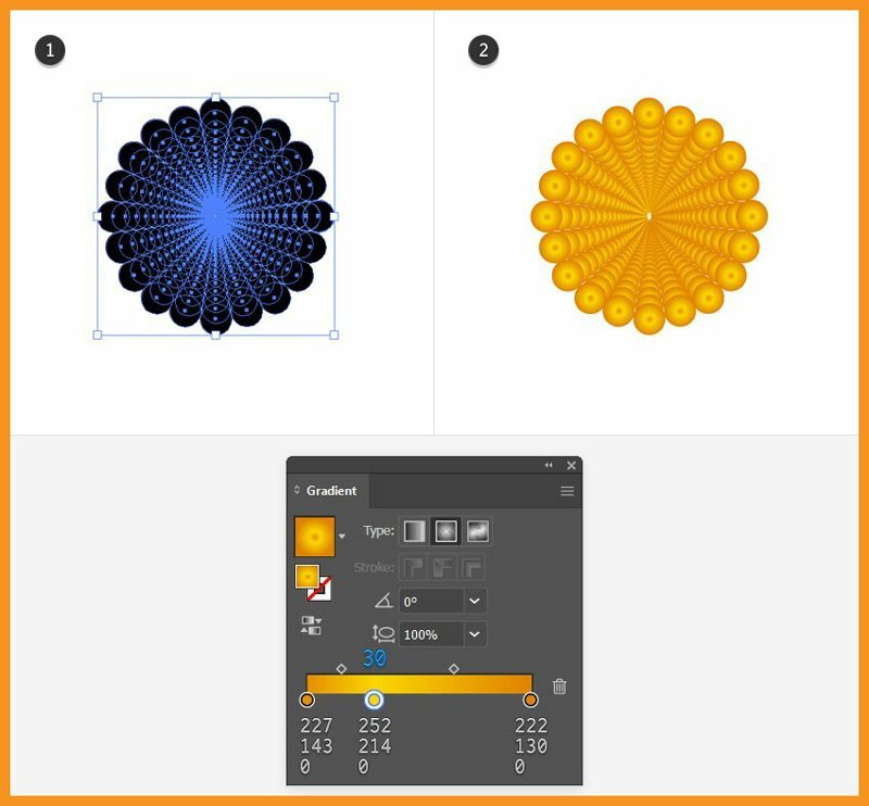
With the circle still selected, go to the Object > Expand Appearance in order to expand the brush stroke and the effect applied. Fill the resulting group with the radial gradient indicated.
Step 6
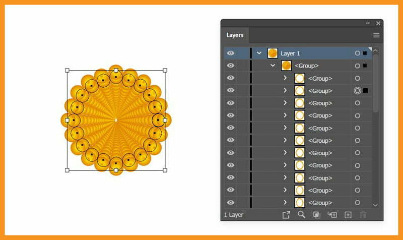
Go to the Layers panel, locate the group and open it. You will see that it’s composed of many other groups of circles arranged in order, from the outside to the center (small circles).
Step 7
Now, I’ll rearrange all these groups. The first group of circles (from the outside) remains as it is. Select the second group from the Layers panel and then go to Object > Transform > Rotate, set the Angle to 10 degrees and click OK.
Then go to Object > Arrange > Bring to Front or use shortcut SHIFT + CTRL + ]
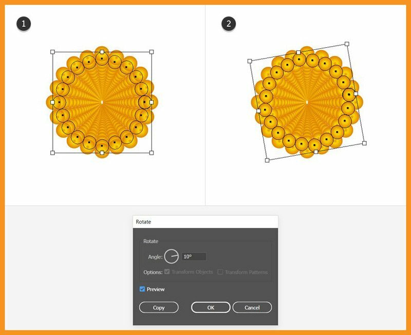
Step 8
Now, I’ll select the third group of circles from the Layers panel and go to Object > Arrange > Bring to Front or shortcut SHIFT + CTRL + ]
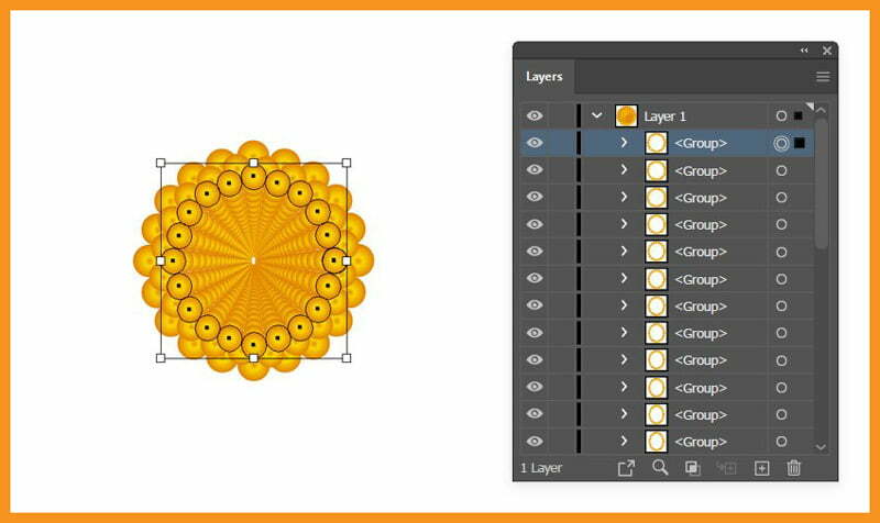
Step 9
Now I’ll select the fourth group of circles and then Rotate 10 degrees and Bring it to Front as I did with the second group. The fifth group again, I’ll just have to Bring it to Front. Repeat this pattern for even and odd groups!
The point is to bring each group in front of the previous one (invert the existing order) and also rotate every second group in order to get the specific look.
Continue with the remaining groups and the center of your flower should look like the next image.
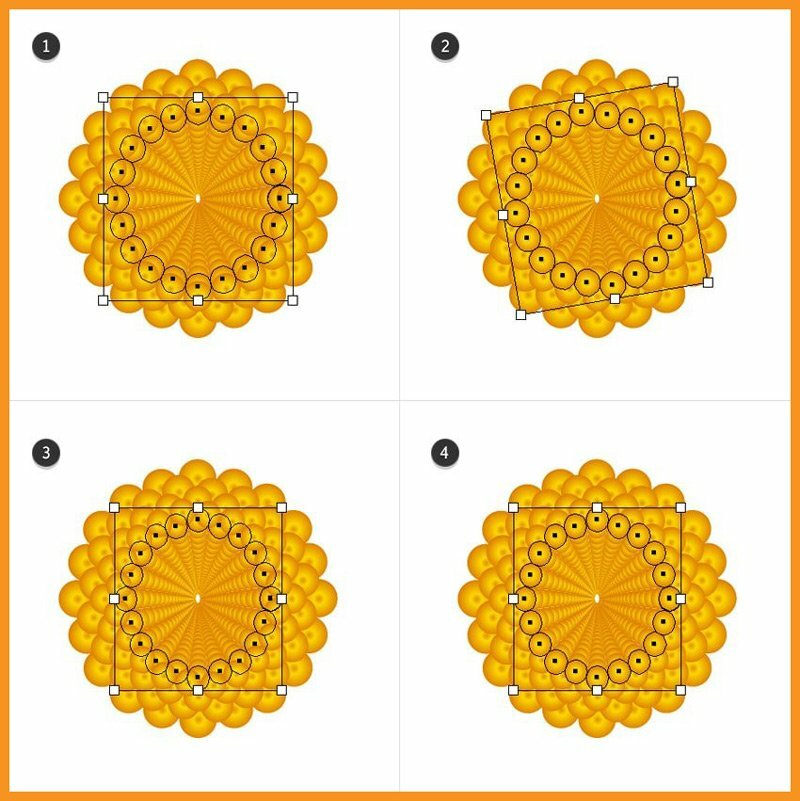
Step 10
Move the entire group to the center of the flower and scale it to about the size of the brown circle.
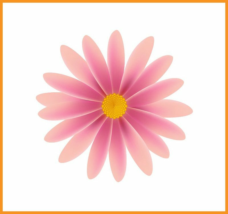
Step 11
Use the Ellipse Tool to draw a circle above the stamens. Mine was about 25 x 25 px. Select black as the fill color and then go to Object > Create Gradient Mesh, choose 2 Rows and 2 Columns and hit OK
Using the Direct Selection Tool, select only the mesh point from the center and replace the black fill color with white. Set this circle to Blending Mode Overlay and 40–50% Opacity.
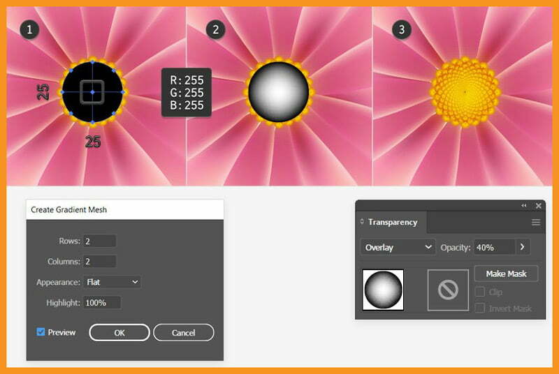
Adding Details to Flower
Step 1
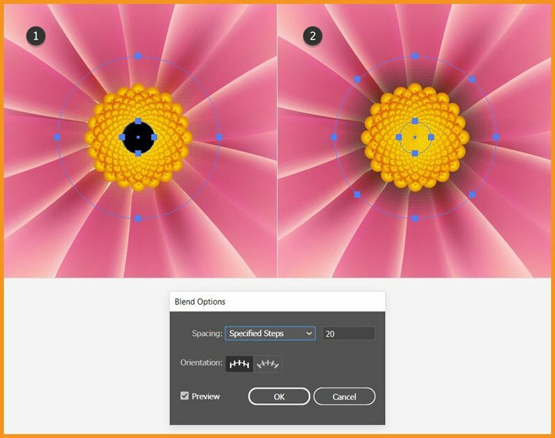
Let’s add details to the flower design. Draw two circles with the Ellipse Tool with the dimensions 45 x 45 px and 9 x 9 px. Fill both circles with black, but set the bigger circle to 0% Opacity.
With both of them selected, go to Object > Blend > Blend Options and choose 20 Specified Steps and then hit OK
Go back to Object > Blend > Make or use shortcut ALT CTRL B
Move the resulting blend group behind the stamens but in front of the petals.

Step 2
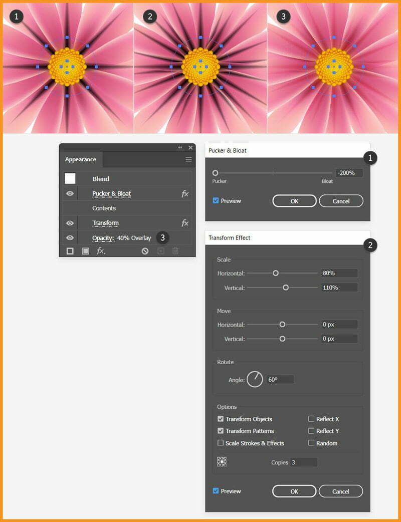
Select the same blend group, go to Effect > Distort & Transform > Pucker & Bloat as shown below.
Don’t release the group yet and go back to Effect > Distort & Transform > Transform as shown below.
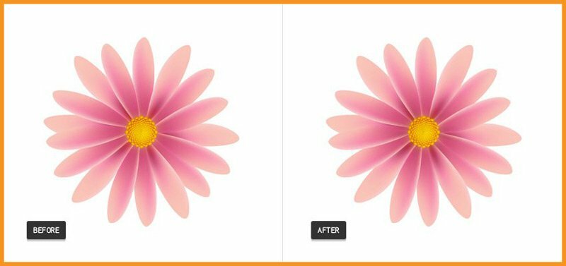
Finally, lower the Opacity of the blend group to 10–20%.
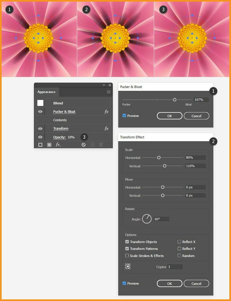
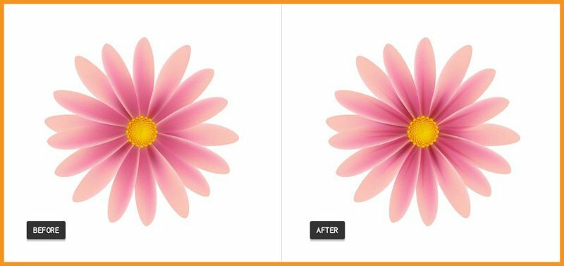
Before and After
Step 3
Draw two more circles with the dimensions 45 x 45 px and 9 x 9 px. Fill both circles with black. Select the bigger circle and go to Object > Path > Add Anchor Points to add four extra points on the path (more points mean more spikes in the next step).
Also, set the bigger circle to 0% Opacity. Blend them using 20 Specified Steps and move the resulting blend group behind the stamens.
Step 4
With the blend group from the previous step selected, apply the Pucker & Bloat effect and then the Transform effect. Set the group to Blending Mode Overlay and 40–50% Opacity.
Before and After
Adding Shadow behind the flower
Step 1
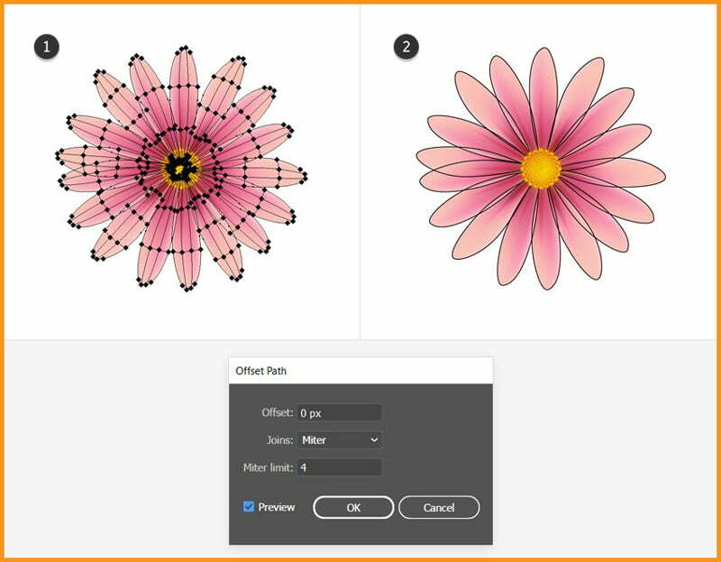
Select all petals, go to Object > Path > Offset Path and apply a 0 px Offset. As a result, I’ll get the shapes of the petals but without the mesh points and lines.
Step 2
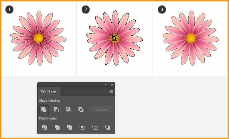
I’ll select all petal shapes obtained in the previous step and click Add in the Pathfinder panel.
After that, I’ll get a compound path. Now, go to Object > Compound Path > Release and delete the small shapes in the center. I’ll only need the outline and I will name it “flower-shape”.
Step 3
Before we continue, make a copy of the “flower-shape” because we’ll need it later for a mask.
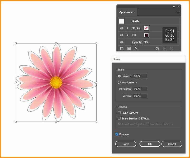
Now, with the original shape selected, go to Object > Transform > Scale, type 109% in the Scale field and click OK
Next, with the Ellipse Tool, draw a circle about the size of the stamens. Fill both shapes with the color shown but set the “flower-shape” to 3% Opacity.
Step 4
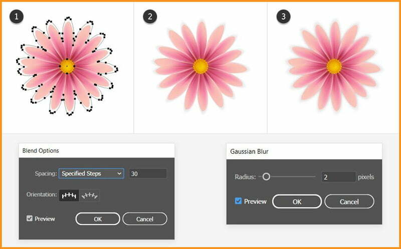
Select the “flower-shape” and the circle. Go to Object > Blend > Blend Options and choose 30 Specified Steps and click OK
Go back to Object > Blend > Make or use shortcut ALT + CTRL + B
Send the resulting blend group behind everything by going to Object > Arrange > Send to Back or use shortcut SHIFT + CTRL + [
At this point, I thought that the shadow was too sharp, so I also applied a 2 px Gaussian Blur by going to Effect > Blur > Gaussian Blur
Adding Shadow between Petals
Step 1
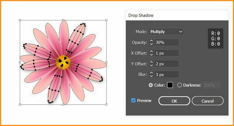
You don’t need to add shadows to all the petals but only for those on top.
Select each petal and then go to Effect > Stylize and apply the Drop Shadow effect as shown below.
Step 2
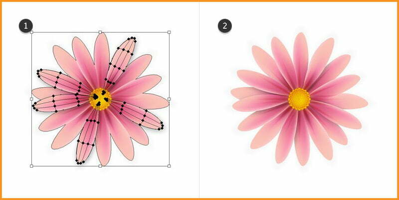
We only want the shadows between the petals where they overlap and not on the outside, because there we have the flower’s shadow. To fix this, we will use a mask.
Take the copy of the “flower-shape” that I mentioned earlier and move it in front of the petals with the help of the Layers panel.
Now, select this shape and change fill to none and stroke to none and also select the group of petals and go to Object > Clipping Mask > Make or use shortcut CTRL + 7
Final Result

How to Create A Pressure Sensitive Brush in Illustrator
In this Adobe Illustrator Tutorial, I will show you, ‘How to Create a Pressure Sensitive Brush in Illustrator’.
How to Create a Pressure Sensitive Brush
It is recommended to have some previous knowledge on, ‘How to set Brush Pressure in Illustrator‘.
Now, we will create a new brush from scratch in Illustrator.
Step – 1
Create the element or a whole design which you want to be convert into brush. A Scatter Brush can be made out of one or more elements.
After creating the elements, select all the parts and Group them using shortcut CTRL + G

Step – 2
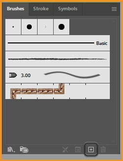
With the group selected, click on the plus icon at the bottom tray of Brush Panel.
Step – 3
Select Scatter Brush from the New Brush dialog box.

Step – 4
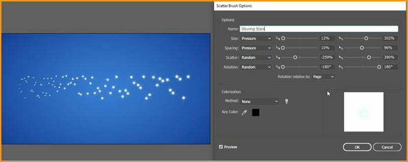
Scatter Brushes have four main settings:
- Size
- Spacing
- Scatter
- Rotation
We can put all of them to pressure but it’s better to put Size and Spacing in pressure. In this case, I would recommend to use random settings at first, click OK. Then draw a line using brush. After drawing option the scatter brush options again, change settings with Preview option checked.
Final comparison
The image below shows the difference between the same brush stroke when drawn by a mouse and a pen tablet.

How to set Brush Pressure in Illustrator
In this byte size Adobe Illustrator Tutorial, I will teach you, ‘How to set Brush Pressure in Illustrator’.
Introduction
If we have a pressure-sensitive graphics tablet, it’s possible to use pen pressure in Illustrator brushes.
However, as Illustrator has five types of brushes with different settings, creating a pressure-sensitive brush can be quite tricky.
We will be discussing them one by one below.
How to set Brush Pressure for Calligraphic Brushes
Follow the following steps:
Step – 1
Open Illustrator, create a Document and then go to Window > Brushes
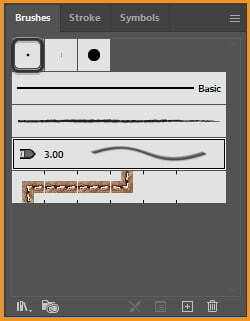
Take Paintbrush Tool and select the first brush from the list — a simple Calligraphic Brush.
Step – 2
If we draw a line with it, we’ll notice it doesn’t matter whether we use a graphics tablet or a mouse, the line looks exactly the same.

Step – 3
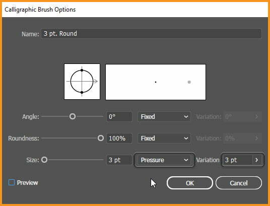
To set the pressure sensitivity for this brush, double-click on its icon in the list.
Calligraphic Brushes have only three settings: Angle, Roundness and Size.
All of them can be linked to the pressure of your pen. To give your lines tapered tips, we just need to set Size to Pressure and increase the Variation.
Step – 4
Press OK and draw another line, pressing lightly at the beginning and strongly at the end. Now the line looks exactly as we would expect!

How to set Brush Pressure for Art Brushes
Follow the following steps:
Step – 1
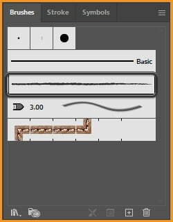
Select the brush in the third row now — “Charcoal – Pencil” an example of an Art Brush.
Step – 2
If we draw a line with it, we’ll notice it actually has a tapered end but only because it’s a part of the shape of the brush — it’s not actually linked to the pressure of your pen.

Step – 3
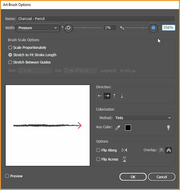
To set the pressure sensitivity for this brush, double-click it to open its settings.
Art Brushes are more complex but for now we’re only interested in the Width property. If we open the drop-down menu next to it, we’ll be able to pick Pressure.
Then, by dragging the markers on the left and right, we can set the Minimum width (low pressure) and the Maximum width (high pressure).
Step – 4
Press OK and draw another line just like before — starting lightly and ending strongly. The width of the line will be adjusted to your pressure!

How to Set the Brush Pressure for Bristle Brushes
Follow the following steps:
Step – 1
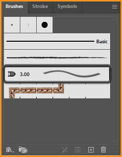
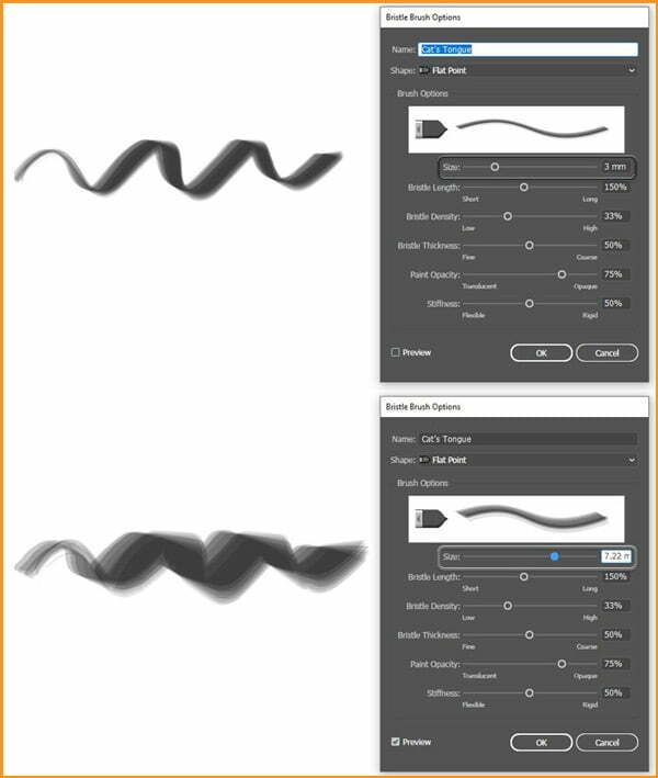
Another brush on the list is “Cat’s Tongue”, and it’s an example of a Bristle Brush.
Step – 2
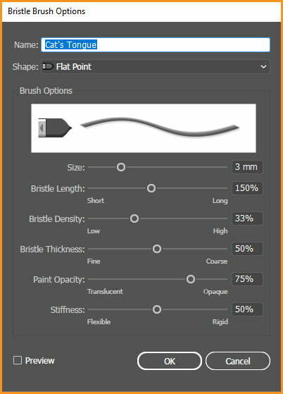
If we open its settings, we’ll notice it doesn’t really have any drop-down menu that we could set to Pressure. This is because Bristle Brushes are pressure-sensitive by default!
Step – 3
If we don’t believe me, just draw a line with your mouse and another one with our pen. The difference is pretty clear!

Step – 4
Bristle Brushes are supposed to imitate traditional brushes and in traditional brushes things are more complicated than “low pressure = small; high pressure = big”.
That’s why we can find a lot of different settings in the Bristle Brush options, and finding the correct configuration may require some experimenting.
However, both Size and Bristle Length are a good place to start if we want to control the general variation in size.
How to Set the Brush Pressure for Pattern Brushes
Follow the following steps:
Step – 1
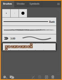
Another brush on the list is “Leather Seam”, an example of a Pattern Brush.
Step – 2
If we draw a line with it, it doesn’t react to pressure:

Step – 3
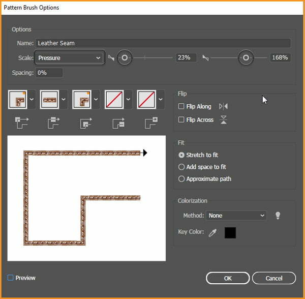
Open its settings. They look quite complicated but again, we’re interested just in one — Scale.
Open its drop-down menu and set it to Pressure. Just like in the Art Brushes, define the Minimum and Maximum size.
Step – 4
Not all Pattern Brushes work nicely with Illustrator brush pen pressure. This one, for example, doesn’t have its beginning and end defined, which works for the mouse — but makes the line go crazy when pressure is involved.

Step – 5
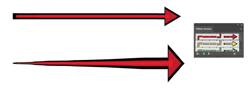
However, if we open the menu in the upper right corner of the panel and go to Open Brush Library > Arrows > Pattern Arrows, we’ll have a chance to experiment with brushes that don’t have this problem.
So if we want to create your own pressure-sensitive Pattern Brush, it’s good to learn from those!
How to Set the Brush Pressure for Scatter Brushes
Follow the following steps:
Step 1
The last type of brush in illustrator is a Scatter Brush.
We won’t find it on the default list, so open the menu and go to Open Brush Library > Decorative > Decorative Scatter.
Select one of these brushes and draw a line.

Step 2
Scatter Brushes have four main settings:
- Size
- Spacing
- Scatter
- Rotation
All of them can be set to Pressure, although Size and Spacing are best suited for it.
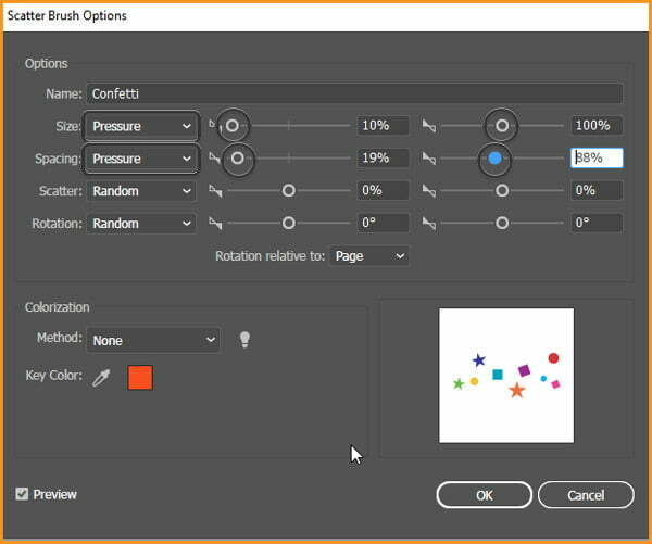
Step 3
Now, compare our pressure-sensitive Scatter Brush to a default one.

How to design a Retro Flower Pattern
In this Adobe Illustrator Tutorial, I will teach you, ‘How to design a Retro Flower Pattern’.
Introduction
If we look at the Retro era, it was dominantely infused with emotions relating to ‘Nature’, ‘Power’, ‘Freedom’ and ‘Peace’. They were the ‘Floral Design’ generation which had a distinct decor style too.
The mood of the decade was ‘Vibrant’, ‘Bright’ and ‘Wild’ as it was influenced by the Hippie movement and Psychedelia.
The 60s were an astronishing time for artists to dip their artistic creativity into experimental styles with dazzling floral patterns, pop arts etc.
The art was reduced to its essential form and it resulted in ‘flat’, ‘crisp’ artworks which were infused with bright colors and bold graphics.
Designs were experimented with optical tricks, distortion, fluid swirls and wraps.
Set up a New Document
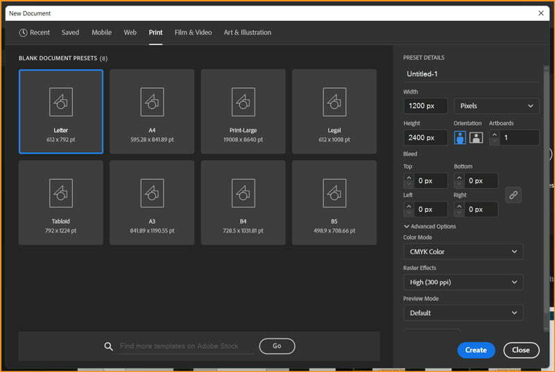
I will open New Document dialog box and change the following values:
| Property | Value |
|---|---|
| Units | Pixels |
| Width | 1200 px |
| Height | 2400 px (double of Width) |
| Color Mode | CMYK |
| Raster Effects | High (300ppi) |
Retro Color Palettes
The Retro era color palette, started with nature-inspired colors like yellow, orange and avocado green. Then the decade went into full bloom with vibrant hues of reds, fuchsia pinks and tangerine orange and later evolved into wilder, bright neon-like colors.
Some common color tones that were used include:
- Greens: Pea Green, Olive, Drab
- Reds: Burnt Sienna, Rust, Pink
- Yellows: Maize, Daisy, Sunflower
- Blues: Ultramarine, Celtic, Cerulean Blue
- Oranges: Saffron, Peach, Tangerine, Harvest Gold
- Psychedelic Colors: Hot Pink, Bright Yellow, Lime Green, Sky Blue
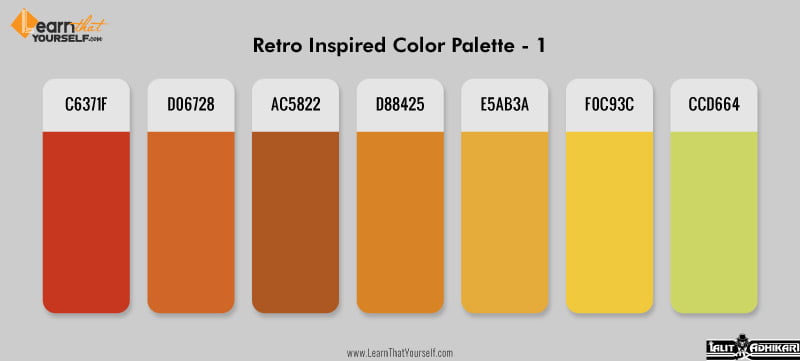
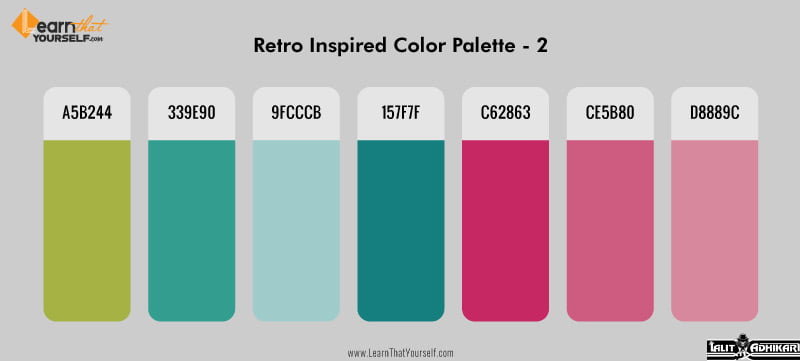
You can download the vector file of above images here.
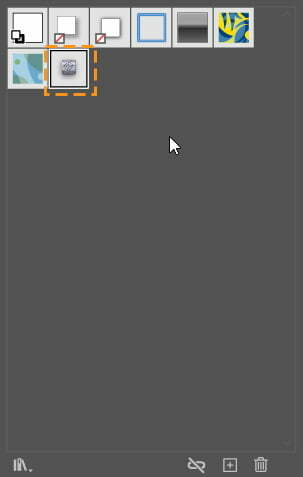
We can save these colors as Color Group in swatches. Select all the Color Palettes. Open Swatches Panel and click on Add New Color Group icon shown below.
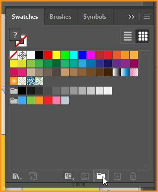
New Color Group dialog box will open up as shown below.
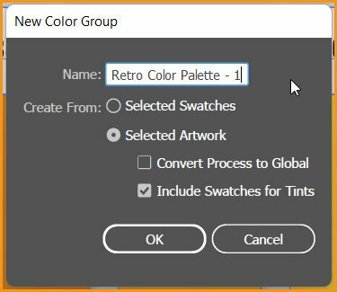
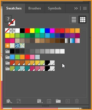
I have already changed the name of Color Group and I will also check the Convert Process to Global checkbox. This checkbox brings two changes:
- The Colors in this Color Group will have a small inverted triangle at the bottom-right corner.
- Whenever these colors are applied, they get linked to this particular swach. Hence later if we change the color in Color Group, it will automatically change color from artwork wherever applied.
How to Create Retro Flowers
During that era, Designers began to embrace the symbolism of flowers in fabrics, textiles and design as a part of the free love, psychedelic movement. The designs back then were mostly geometric and consisted of simple floral artwork.
The pattern style were characterized as being very cheerful, colorful and bold. The florals were mainly large & geometric and they featured stylized graphics.
As for the colors, most floral prints were saturated in hues of red, purple and hot pink and complemented with vibrant hues of bright greens, oranges and ultramarine blue.
We will create six flower set for the pattern.
Step – 1
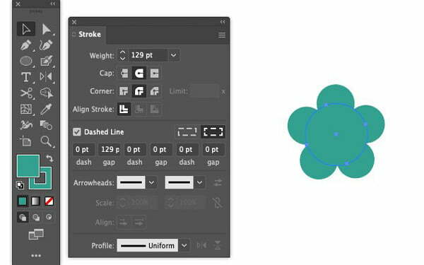
For the first flower, select the Ellipse Tool (L) and open the Stroke panel (Window > Stroke). In the stroke panel, select Cap: Round Cap and Corner: Round Join.
Set the Stroke and Fill color to #339E90. Stroke weight to 129 pt, check the Dashed Line box and set the dash to 0 pt and gap to 129 pt.
Create an Ellipse of about 350px.
Step – 2
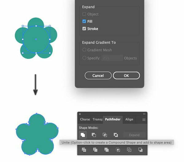
Now, we will expand the path: Object > Path > Expand.
Then Object > Expand Appearance which will open the Expand dialog box.
Make sure Fill and Stroke are ticked and click OK.
Open the Pathfinder panel (Window > Pathfinder). Apply Shape Modes: Unite. It will unify the selected objects into a single shape.
Step – 3
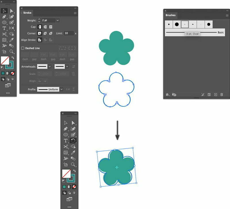
Use Selection Tool to select the flower shape. Hold SHIFT & ALT keys to constrain the movement and duplicate the selection by dragging the cursor down.
Open the Brushes panel (Window > Brushes) and apply #157F7F color and 3 pt Oval brush at 2 pt Stroke Weight to the duplicated shape.
Then with the Selection Tool drag the outline over the original shape and use the Rotate Tool to give it a slight turn with reference point at center.
Step – 4
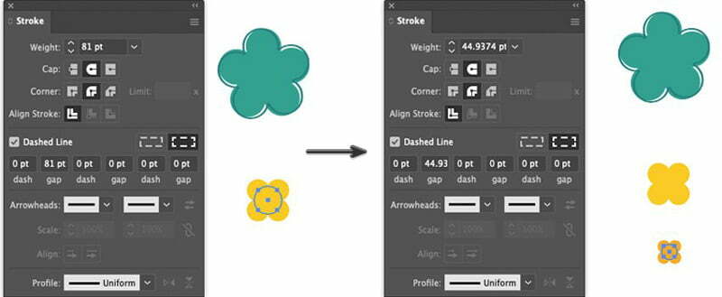
Now we will create the flower pistil. Again, take Ellipse Tool with Stroke and Fill color of #F0C93C.
Create a 103 px ellipse with Stroke weight of 81 pt. Tick the Dashed Line box and set the dash to 0 pt and gap to 81 pt.
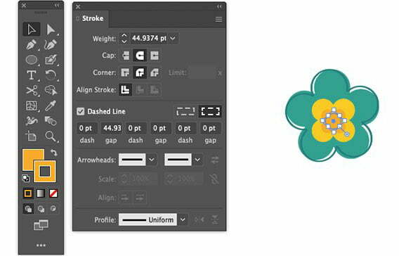
Then create another ellipse with Stroke and Fill color of #E5AB3A, Stroke weight of 44.93 pt and set the dash to 0 pt and gap to 44.93 pt. It may go to approximate values as per our document.
With the Selection Tool, manually move both floral elements to the inside of the larger petal shape.
Step – 5
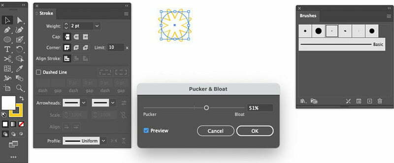
Let’s create another flower, take the Ellipse Tool and apply a 2 pt Stroke Weight with white Fill and Stroke color of #F0C93C.
Apply 3 pt Oval brush from the Brushes panel.
Then Object > Path > Add Anchor Points and Effect > Distort & Transform > Pucker & Bloat which will be set at 51%.
Step – 6
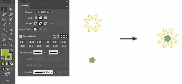
For inner parts of the flower, select Ellipse Tool with Stroke and Fill color of #A5B244, create a 55 px ellipse with the Stroke Weight set to 34.8 pt. (It may go into approximate value because of document type and size.)
Check the Dashed Line box and set the dash to 0 pt and gap to 34.8 pt.
Then move the new shape to the center of the flower petals. Now we have our second flower ready.
Step – 7
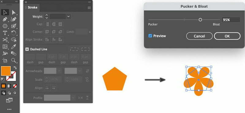
Now, we will create one more flower. Select Polygon Tool and click once on the artboard to open the Polygon dialog box, set the Radius to about 260 px, Sides to 5 and click OK.
Stroke to be null and Fill color should be #D88425. Then apply a Pucker & Bloat effect. Effect > Distort & Transform > Pucker & Bloat which should be set around 95%.
Step – 8
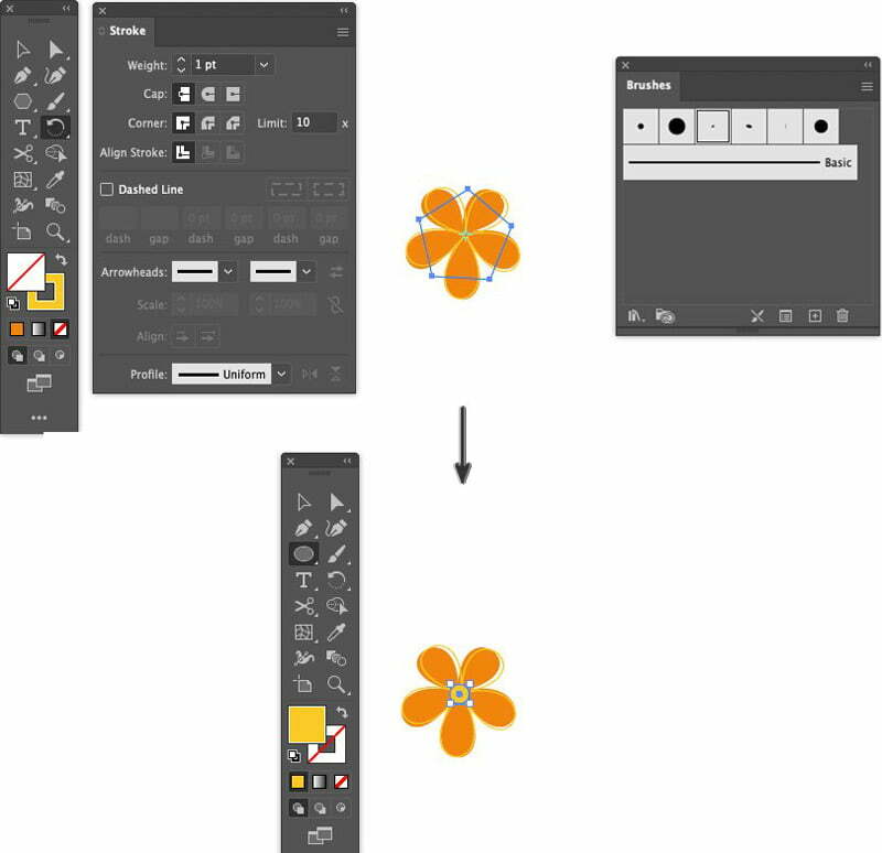
We will select the petal shape, Copy and Paste to Front using shortcuts CTRL + C for copy and CTRL + F for paste in front.
Remove Fill color, apply 1 pt Stroke Weight with Stroke color of #F0C93C.
Select Ellipse Tool with a Fill color of #F0C93C and draw a small ellipse of 55 px on the inside of the flower.
Step – 9
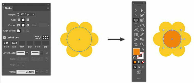
Again, creating petals for another flower. Take the Ellipse Tool. In the Stroke panel, set the Stroke weight to 103.5 pt, Cap: Round Cap and Corner: Round Join and set Stroke and Fill color to #F0C93C. Check the Dashed Line box and set the dash to 0 pt and gap to 103.6 pt.
After creating it, change the Ellipse Tool settings to null Stroke and Fill color of #D88425 and draw an ellipse of 136 px inside the flower.
Step – 10
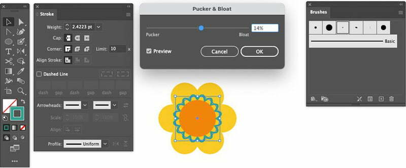
This time we will add scallop decoration to the inside of the flower. With the inside shape selected, Copy and Paste to Front.
Hold SHIFT & ALT keys to constrain the size and scale up the shape slightly. Apply null Fill, 2.4 pt Stroke weight with a Stroke color of #339E90 and a 3 pt Oval brush.
Object > Path > Add Anchor Points twice and then Object > Path > Add Anchor Points and Effect > Distort & Transform > Pucker & Bloat which will be set at 14%.
Step – 11
Now, for creation of the next flower, take the Polygon Tool.
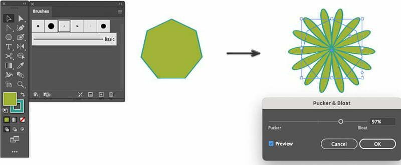
Click once on the artboard to open the Polygon dialog box, set the Radius to about 273 px, Sides to 7 and click OK.
Apply a 3 pt Oval brush at 2 pt Stroke Weight with #A5B244 as Fill color and Stroke color of #339E90.
Object > Path > Add Anchor Points to the polygon shape, and apply an Effect > Distort & Transform > Pucker & Bloat which will be set at 95%.
Step – 12
Select Polygon Tool. Click once on the artboard to open the Polygon dialog box and set the Radius to about 205 px, Sides to 7 and click OK.
Apply 3 pt Oval brush at 2 pt Stroke Weight, with #A5B244 Fill and Stroke color of #339E90.
Apply an Effect > Distort & Transform > Pucker & Bloat which will be set at 95% and use the Selection Tool to manually place the flower inside the bigger flower petals.
Now, select Ellipse Tool set a null Stroke and a Fill color of #F2CC22 and draw a small ellipse of about 44 px inside the flower. It should look similar to the image below.

Step – 13
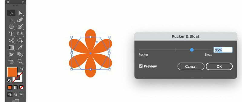
For the last flower, again, select the Polygon Tool. Open the Polygon dialog box and set the Radius to about 295 px, Sides to 6 and click OK.
Apply null Stroke and a Fill color of #D06728.
Apply an Effect > Distort & Transform > Pucker & Bloat which will be set at 95%
Step – 14
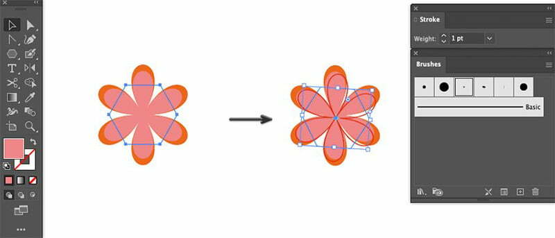
Select the petal shape and Copy and Paste to Front. Scale the shape down while holding SHIFT & ALT keys to constrain the size and apply Fill color of #D88586.
Then again, Copy and Paste to Front, the selected shape. Apply a Stroke color of #C6371F with a 3 pt Oval brush and a 1 pt Stroke Weight.
Take the Rotate Tool to slightly turn the shape.
Step – 15
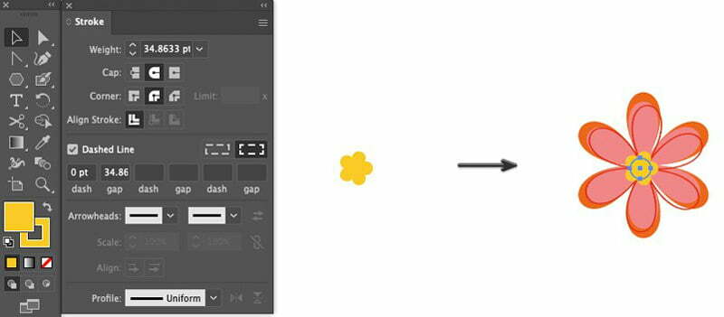
For the inside of the flower, take the Ellipse Tool and apply Stroke and Fill color of #F0C93C with the Stroke set to 34.8 pt.
From the Stroke panel, make sure the Dashed Line box is checked and set the dash to 0 pt and gap to 34.8 pt and create a 55 px ellipse.
Using the Selection Tool, move the little yellow flower to the center of this flower group.
Step – 16
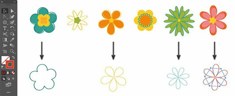
By now, we have six retro style flower. Before we group them, we will create simple flower outlines to use for our pattern decoration.
Take the Selection Tool to select the border flower shape from each flower. Hold down the Shift-Alt keys to constrain movement, and duplicate the selection by dragging the cursor down. I selected four out of six flowers to use.
Remove the Fill color and we can change the stroke colors. Then Group each flower set together by using shortcut CTRL + G.
How to create a Pattern in illustrator
Follow the following steps to create a retro flower pattern in illustrator.
Step – 1
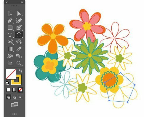
Now let’s create our Retro Floral Pattern. Take the Selection Tool and manually move and organize the flowers into a group that looks pleasant.
Feel free to scale or rotate the elements using the Rotate Tool.
Step – 2
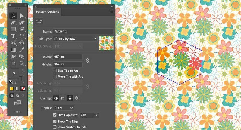
Select All using shortcut CTRL + A.
Then go to, Object > Pattern > Make
In the Pattern Options dialog box set the following options:
- Name: (as you like)
- File Type: Hex by Row
- Width: 960 px
- Height: 969 px
- Copies: 9 x 9
Click Done on the option bar to exit the Pattern Mode.
You can move the elements around to fit the hexagon. Now you have created a seamless repeating pattern.
Step – 3
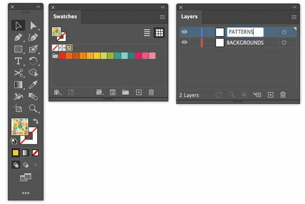
The Retro Floral Pattern Swatch will appear automatically in the Swatches panel.
Once the Retro Floral Pattern Swatch is created, you can select and Hide the shape groups we created on the artboard by going to Object > Hide > Selection
Currently, our pattern does not have a background color. We have to create that separately.
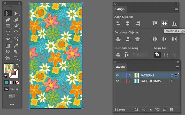
Open the Layers panel. Rename ‘Layer 1’ to ‘BACKGROUNDS’. Then click the Create New Layer icon and name the new layer ‘PATTERNS’.
Step – 4
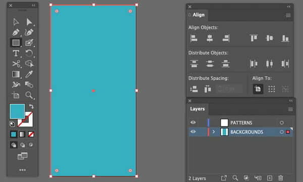
Now, let’s set our background color.
Make sure you are working on the ‘BACKGROUNDS’ layer.
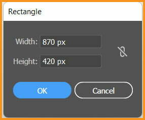
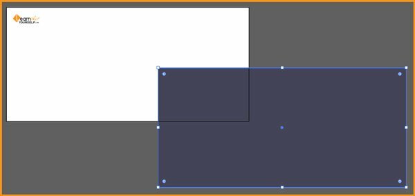
Grab the Rectangle Tool with the #51ACBD color Fill selected and null Stroke. Click once on the artboard to open the Rectangle dialog box and set the Width to 1200 px and Height to 2400 px
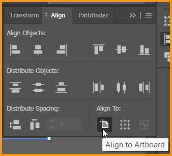
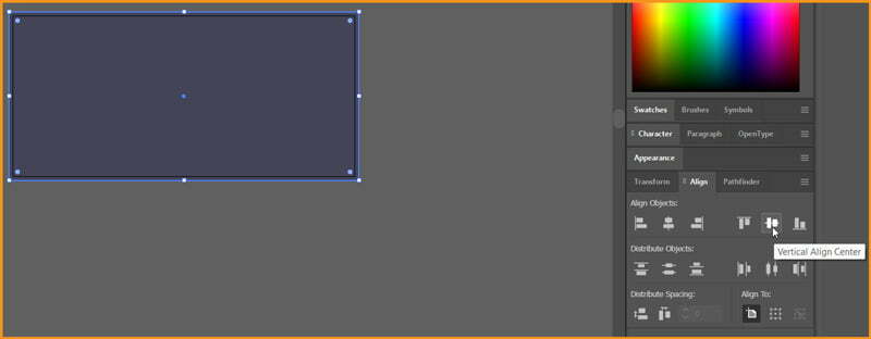
Open the Align panel. Make sure Align to Artboard is selected and click Horizontal Align Center and Vertical Align Center.
Step – 5
Next, let’s move to the ‘PATTERNS’ layer in the Layers panel.
Pick the Rectangle Tool and select our ‘Pattern 1’ as the Fill. Click once on the artboard to open the Rectangle dialog box and set the Width to 1200 px and Height to 2400 px
Then click Horizontal Align Center and Vertical Align Center.
We have created our Retro flower pattern design. We can move on to create color variations of the pattern design by simply changing colors of background.
